
Home
Resume
Redesigning how HR teams run workforce operations at scale
Edge · 2025
HR tech
B2B
Interaction design
Background
Workforce operations at Edge were largely managed through third-party tools. As the company scaled, its unique operating model required more flexibility and ownership than external systems could provide.
To reduce costs and gain more control over workforce data, we migrated core HR workflows into an in-house system. This case study focuses on a key part of that system: the workforce overview, including how employees are added to the system.
The designs shown here are an improved concept of what was shipped, based on what I learned from the project.
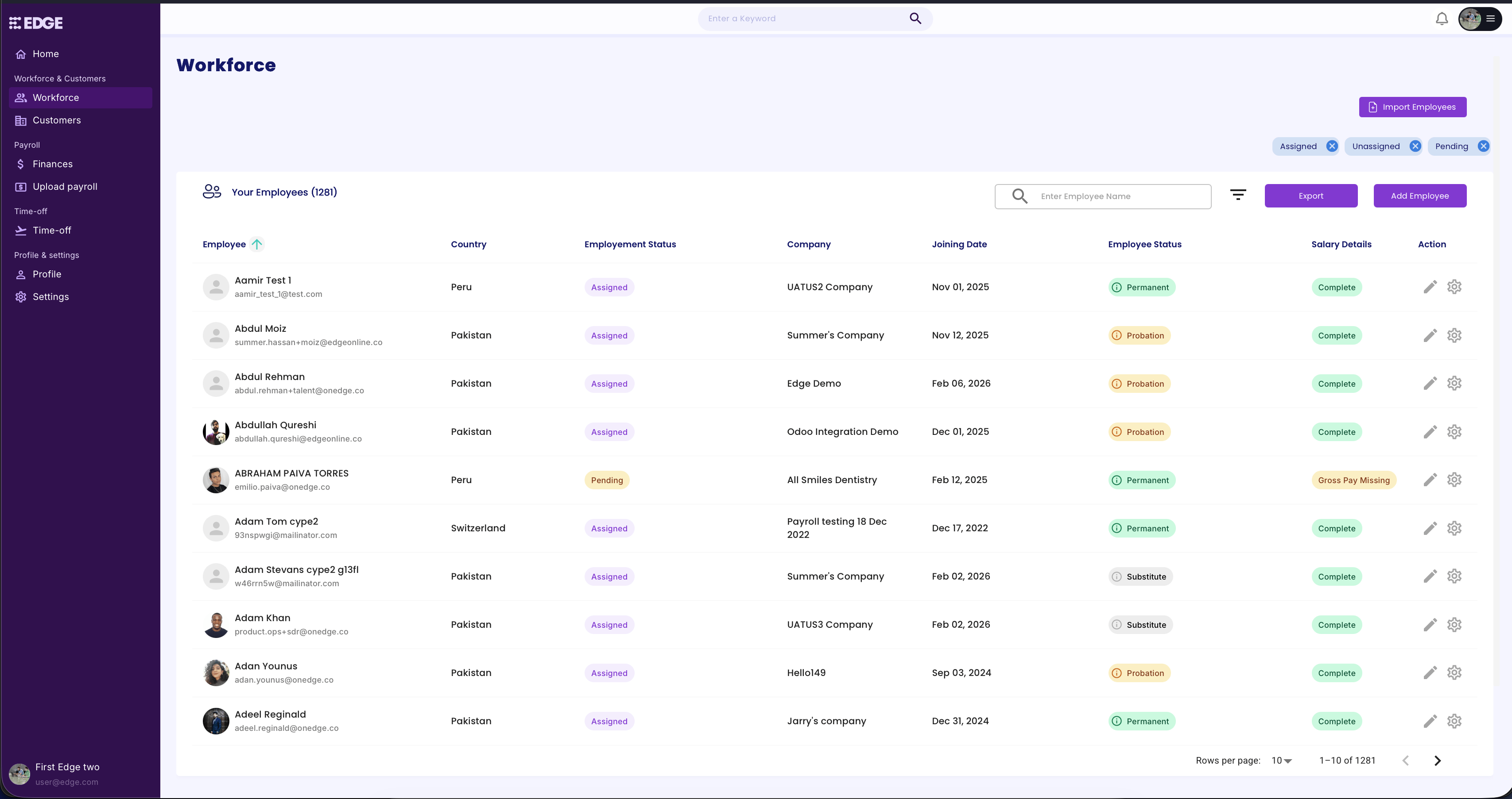
Initial version of the Workforce table
Problem
The initial version was put together quickly to get things working. While functional, it lacked structure, wasn't scalable, and didn't give HR teams the speed or control they needed for complex workflows.
I worked closely with the HR team during this period, which gave me a clear picture of their process, pain points, and objectives. So I worked on a redesign to address the gaps.
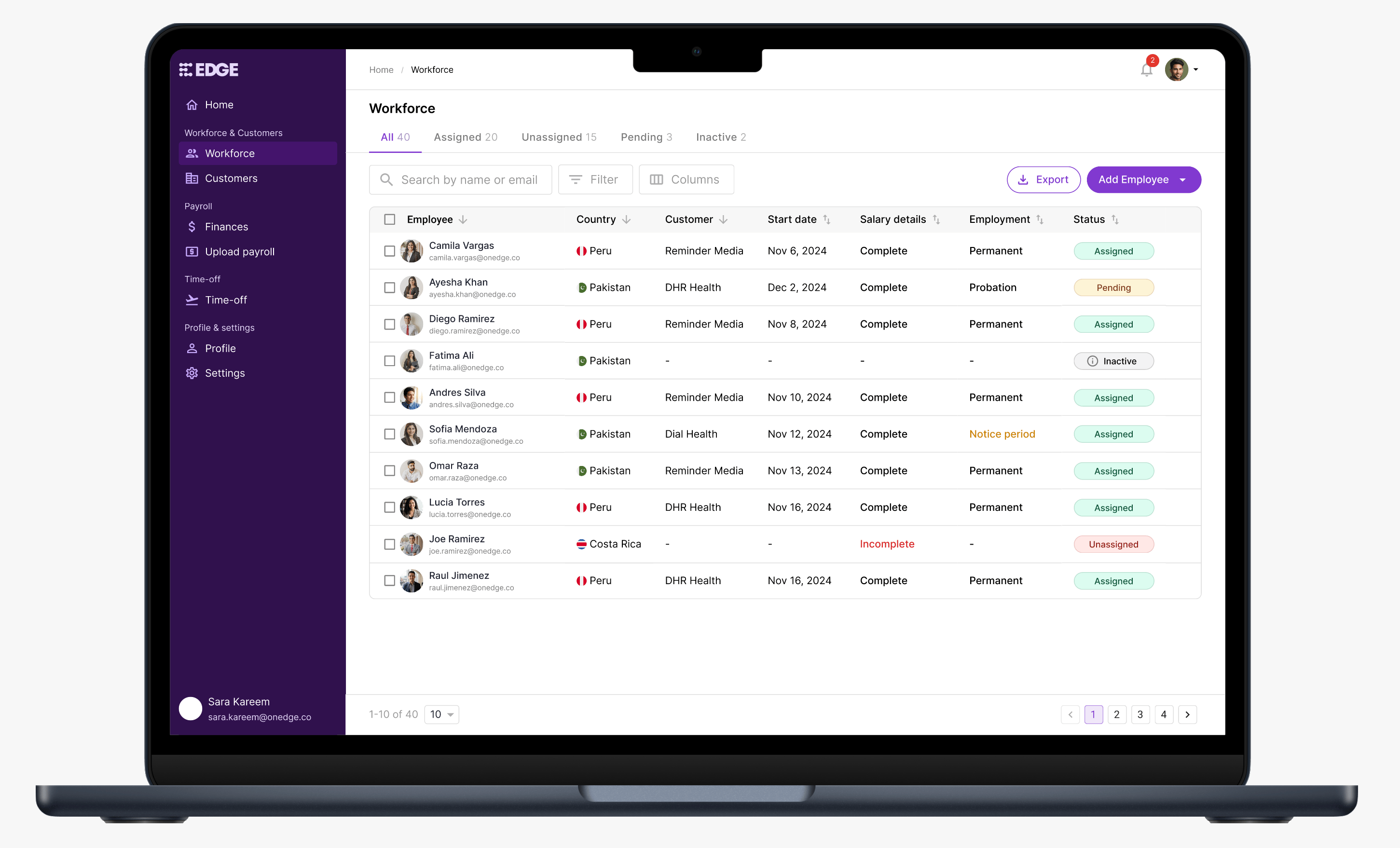
Redesigned Workforce table
Solution
I redesigned the table to be more compact, with better information hierarchy and muted status badges to reduce visual noise. To help HR teams navigate faster, I introduced tabs to organize employees by assignment status.
Other than status, visual emphasis was reserved only for states that required attention, such as incomplete salary details or employees in their notice period.
Since the admin portal didn't support multi-user access with different roles, giving users control over which columns to show or hide was important to keep the table relevant to their needs and scalable as the system grows.
Hovering on some status badges reveals additional details, giving users quicker access to key information without having to open the employee profile.
Improved filters allowed users to quickly narrow down the employee list to act on specific groups. For example, identifying employees in their notice period who may need offboarding preparation.
Multi-row selection was added to support bulk actions like export. While the immediate use case was limited, it was a deliberate decision to keep the table scalable for future use cases.
I expanded the export functionality to give users granular control over what data they download. This was particularly useful as workforce data was frequently shared across teams like HR, Finance, and Marketplace.
Initial version of the Add Employee page
Problem
Adding an employee was managed through a form with all fields packed onto one page. It was put together quickly to keep operations running, and while it covered the necessary data points, the lack of structure made it overwhelming to complete.
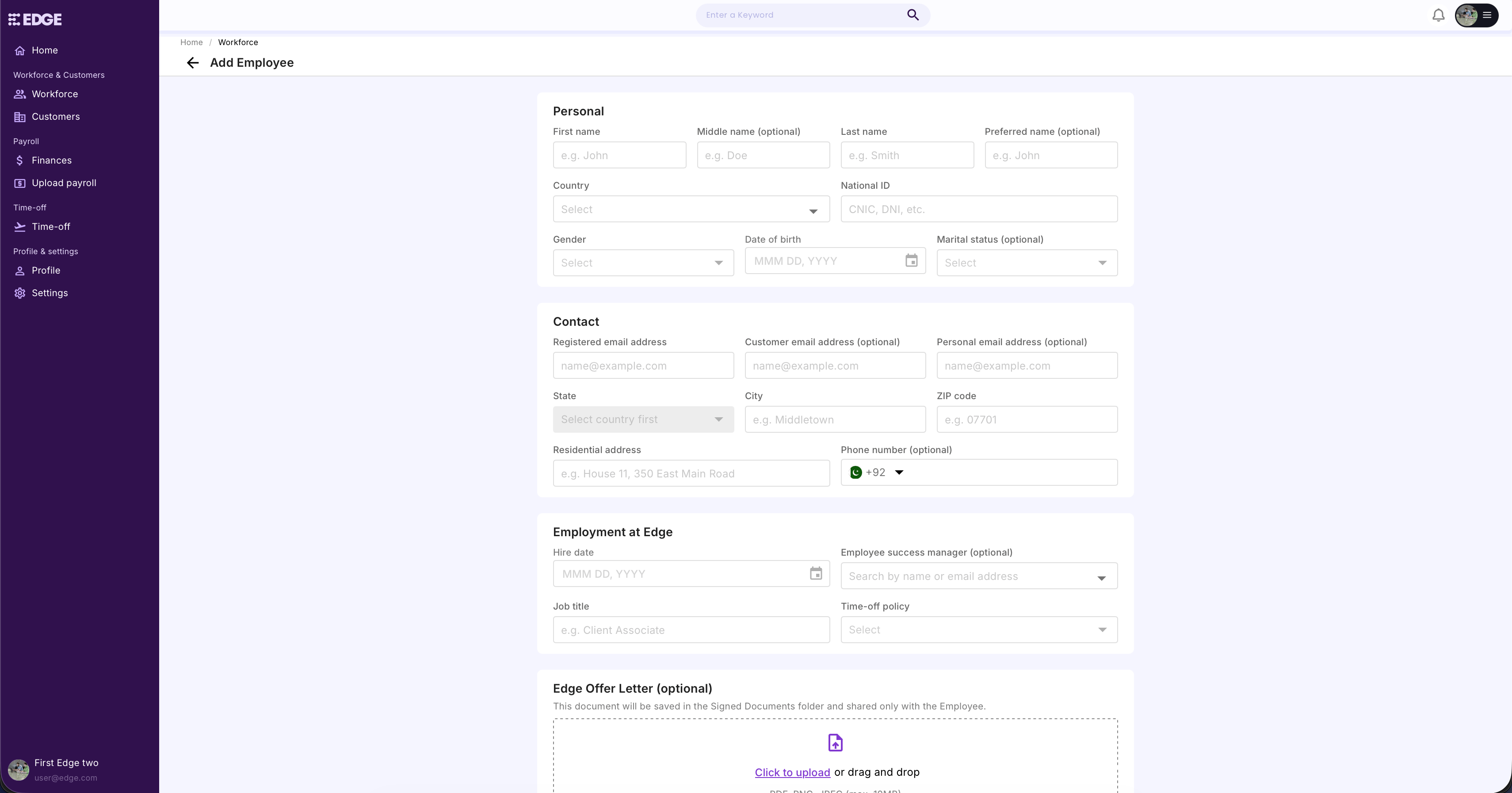
Redesigned Add Employee page
Solution
I restructured the form into four steps: Personal, Contact & Address, Employment, and Review. This reduced the cognitive load of filling out a large amount of information at once, making the process feel more manageable. A final review step helps users verify all details before saving to minimize errors.
Key takeaways
Internal tools are often deprioritized in favor of customer-facing products, but investing in them can have a real impact on day-to-day operations. This redesign was a reminder that internal experiences deserve the same design attention.
Working through the interactions also showed me how small design decisions can add up to make a product more scalable and ready for future needs.


© 2026 Osama Noor
Made in Karachi, by yours truly.
Last updated on Feb 28, 2026

Osama Noor
Home
Resume
Redesigning how HR teams run workforce operations at scale
Edge · 2025 ·
HR tech
B2B
Interaction design
Background
Workforce operations at Edge were largely managed through third-party tools. As the company scaled, its unique operating model required more flexibility and ownership than external systems could provide.
To reduce costs and gain more control over workforce data, we migrated core HR workflows into an in-house system. This case study focuses on a key part of that system: the workforce overview, including how employees are added to the system.
The designs shown here are an improved concept of what was shipped, based on what I learned from the project.
Initial version of the Workforce table
Problem
The initial version was put together quickly to get things working. While functional, it lacked structure, wasn't scalable, and didn't give HR teams the speed or control they needed for complex workflows.
I worked closely with the HR team during this period, which gave me a clear picture of their process, pain points, and objectives. So I worked on a redesign to address the gaps.
Redesigned Workforce table
Solution
I redesigned the table to be more compact, with better information hierarchy and muted status badges to reduce visual noise. To help HR teams navigate faster, I introduced tabs to organize employees by assignment status.
Other than status, visual emphasis was reserved only for states that required attention, such as incomplete salary details or employees in their notice period.
Since the admin portal didn't support multi-user access with different roles, giving users control over which columns to show or hide was important to keep the table relevant to their needs and scalable as the system grows.
Hovering on some status badges reveals additional details, giving users quicker access to key information without having to open the employee profile.
Improved filters allowed users to quickly narrow down the employee list to act on specific groups. For example, identifying employees in their notice period who may need offboarding preparation.
Multi-row selection was added to support bulk actions like export. While the immediate use case was limited, it was a deliberate decision to keep the table scalable for future use cases.
I expanded the export functionality to give users granular control over what data they download. This was particularly useful as workforce data was frequently shared across teams like HR, Finance, and Marketplace.
Initial version of the Add Employee page
Problem
Adding an employee was managed through a form with all fields packed onto one page. It was put together quickly to keep operations running, and while it covered the necessary data points, the lack of structure made it overwhelming to complete.
Redesigned Add Employee page
Solution
I restructured the form into four steps: Personal, Contact & Address, Employment, and Review. This reduced the cognitive load of filling out a large amount of information at once, making the process feel more manageable. A final review step helps users verify all details before saving to minimize errors.
Key takeaways
Internal tools are often deprioritized in favor of customer-facing products, but investing in them can have a real impact on day-to-day operations. This redesign was a reminder that internal experiences deserve the same design attention.
Working through the interactions also showed me how small design decisions can add up to make a product more scalable and ready for future needs.

© 2026 Osama Noor
Made in Karachi, by yours truly.
Last updated on Feb 28, 2026
Osama Noor
Home
Resume
Redesigning how HR teams run workforce operations at scale
Edge · 2025 ·
HR tech
B2B
Interaction design
Background
Workforce operations at Edge were largely managed through third-party tools. As the company scaled, its unique operating model required more flexibility and ownership than external systems could provide.
To reduce costs and gain more control over workforce data, we migrated core HR workflows into an in-house system. This case study focuses on a key part of that system: the workforce overview, including how employees are added to the system.
The designs shown here are an improved concept of what was shipped, based on what I learned from the project.
Initial version of the Workforce table
Problem
The initial version was put together quickly to get things working. While functional, it lacked structure, wasn't scalable, and didn't give HR teams the speed or control they needed for complex workflows.
I worked closely with the HR team during this period, which gave me a clear picture of their process, pain points, and objectives. So I worked on a redesign to address the gaps.
Redesigned Workforce table
Solution
I redesigned the table to be more compact, with better information hierarchy and muted status badges to reduce visual noise. To help HR teams navigate faster, I introduced tabs to organize employees by assignment status.
Other than status, visual emphasis was reserved only for states that required attention, such as incomplete salary details or employees in their notice period.
Since the admin portal didn't support multi-user access with different roles, giving users control over which columns to show or hide was important to keep the table relevant to their needs and scalable as the system grows.
Hovering on some status badges reveals additional details, giving users quicker access to key information without having to open the employee profile.
Improved filters allowed users to quickly narrow down the employee list to act on specific groups. For example, identifying employees in their notice period who may need offboarding preparation.
Multi-row selection was added to support bulk actions like export. While the immediate use case was limited, it was a deliberate decision to keep the table scalable for future use cases.
I expanded the export functionality to give users granular control over what data they download. This was particularly useful as workforce data was frequently shared across teams like HR, Finance, and Marketplace.
Initial version of the Add Employee page
Problem
Adding an employee was managed through a form with all fields packed onto one page. It was put together quickly to keep operations running, and while it covered the necessary data points, the lack of structure made it overwhelming to complete.
Redesigned Add Employee page
Solution
I restructured the form into four steps: Personal, Contact & Address, Employment, and Review. This reduced the cognitive load of filling out a large amount of information at once, making the process feel more manageable. A final review step helps users verify all details before saving to minimize errors.
Key takeaways
Internal tools are often deprioritized in favor of customer-facing products, but investing in them can have a real impact on day-to-day operations. This redesign was a reminder that internal experiences deserve the same design attention.
Working through the interactions also showed me how small design decisions can add up to make a product more scalable and ready for future needs.
Back to Home
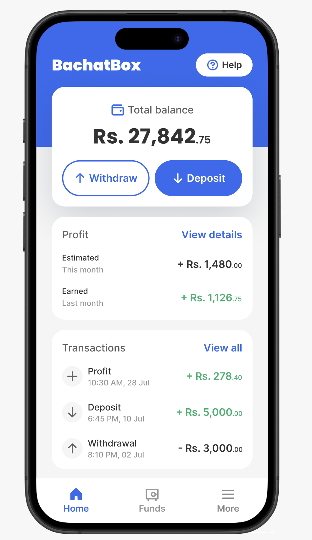
Designing a savings solution for underserved users
BachatBox · 2023

© 2026 Osama Noor
Made in Karachi, by yours truly.
Last updated on Feb 28, 2026