
Home
Resume
Improving usability in a ledger app for small businesses
CreditBook · 2022
Fintech
B2B
Redesign

Background
I joined CreditBook as a Senior Product Designer in late 2021 as part of a team of three designers and two user researchers.
At the time, CreditBook’s business management app was beginning to show friction as the company explored new growth areas.
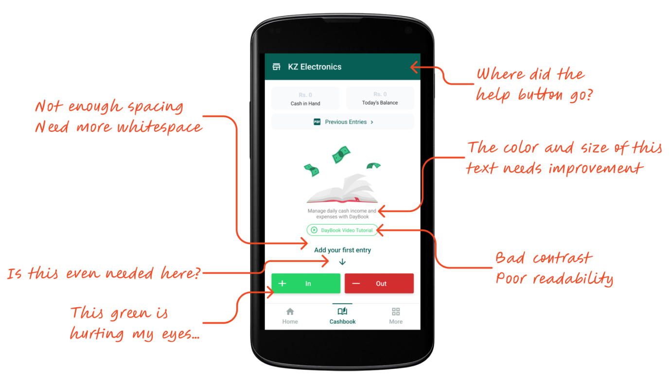
This is how the app looked like when I joined CreditBook
Challenge
New users found the app difficult to use, long-time users began switching to competitors, and newly launched features struggled with adoption.
The visual identity resembled WhatsApp, leading to brand misalignment and an inconsistent user experience.
Research
We conducted user interviews and usability testing with active and recently churned users to understand pain points and behaviors.
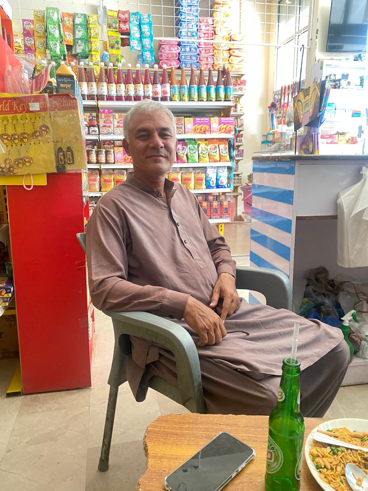
Our core users were small-to-medium business owners, primarily aged 30–45, and late adopters of technology.


What we learned
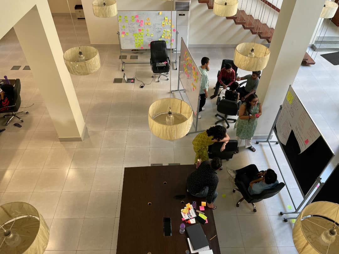
We ran a collaborative synthesis session where designers and researchers shared their notes to uncover recurring themes and patterns.
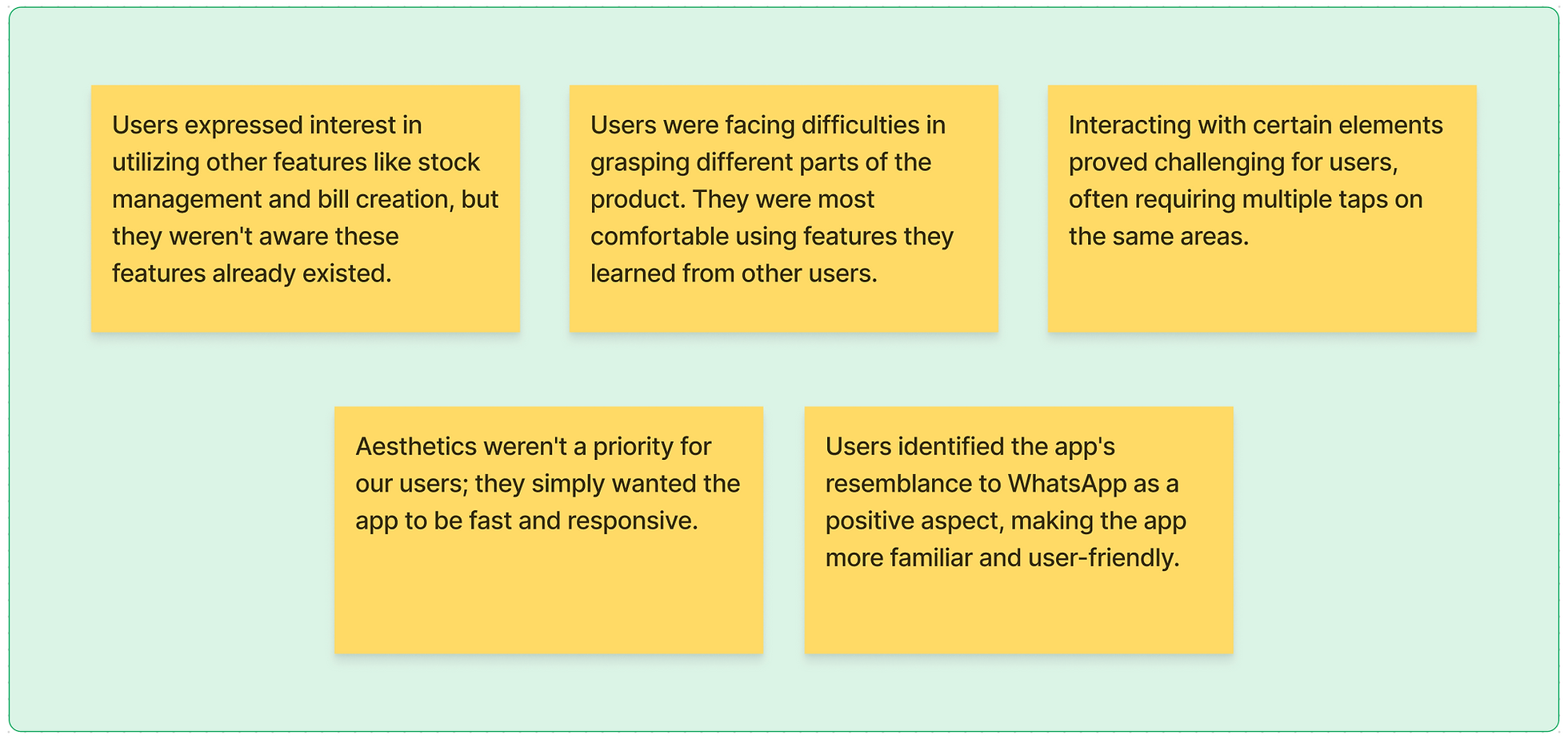
After a round of prioritization, we highlighted the following observations.
Design strategy
The findings made it clear that isolated fixes wouldn’t resolve the systemic issues across the product.
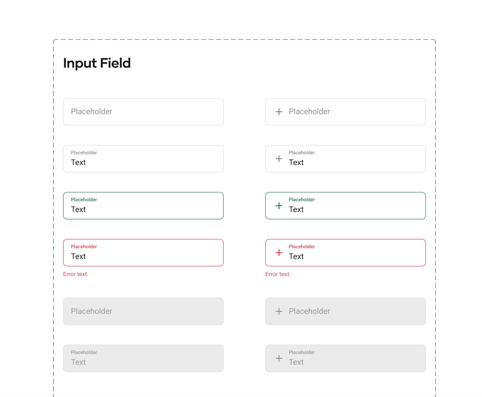
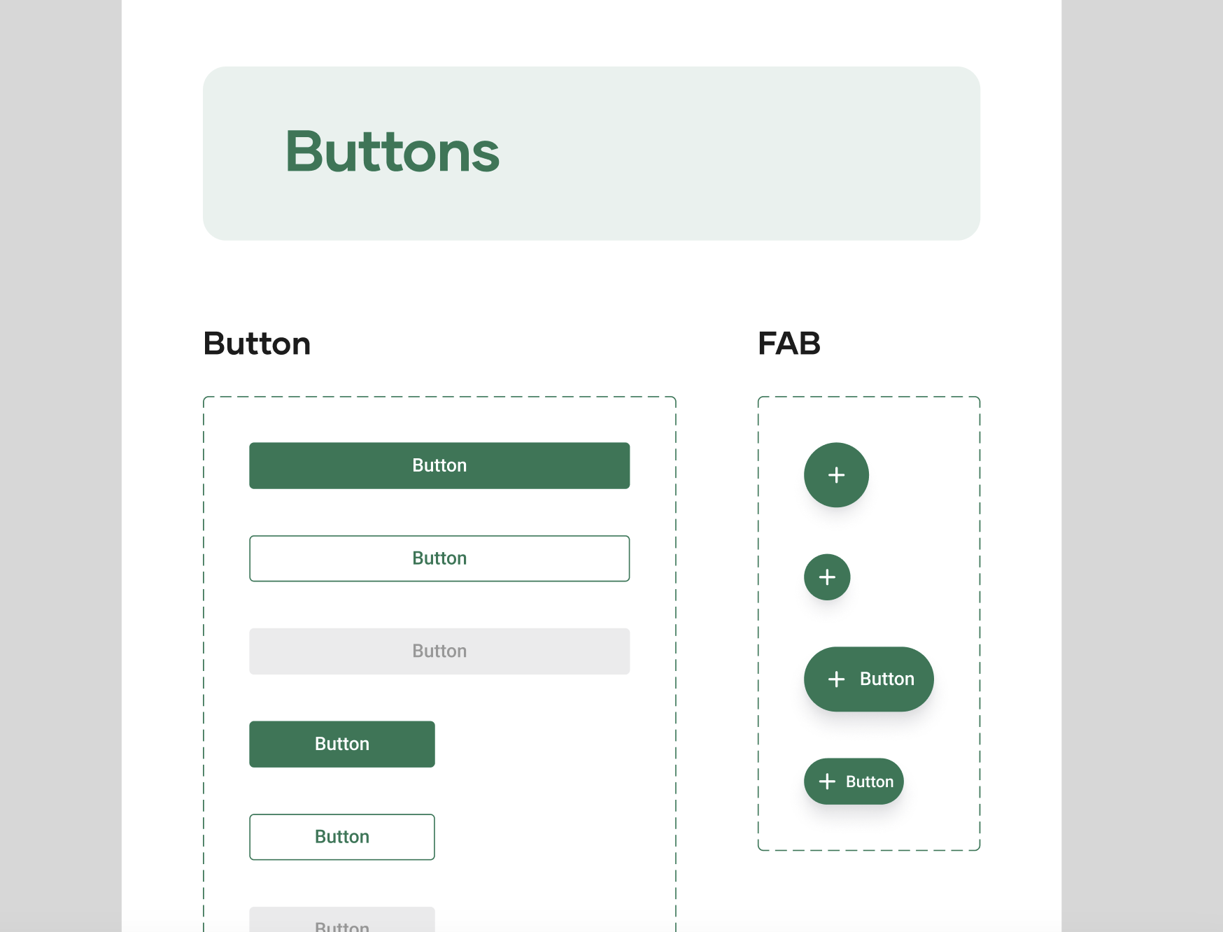
I proposed creating a design system to address core UI inconsistencies while redesigning key modules to improve the experience.
With approval from the Head of Design, I built the company’s first design system from the ground up.

Implementation
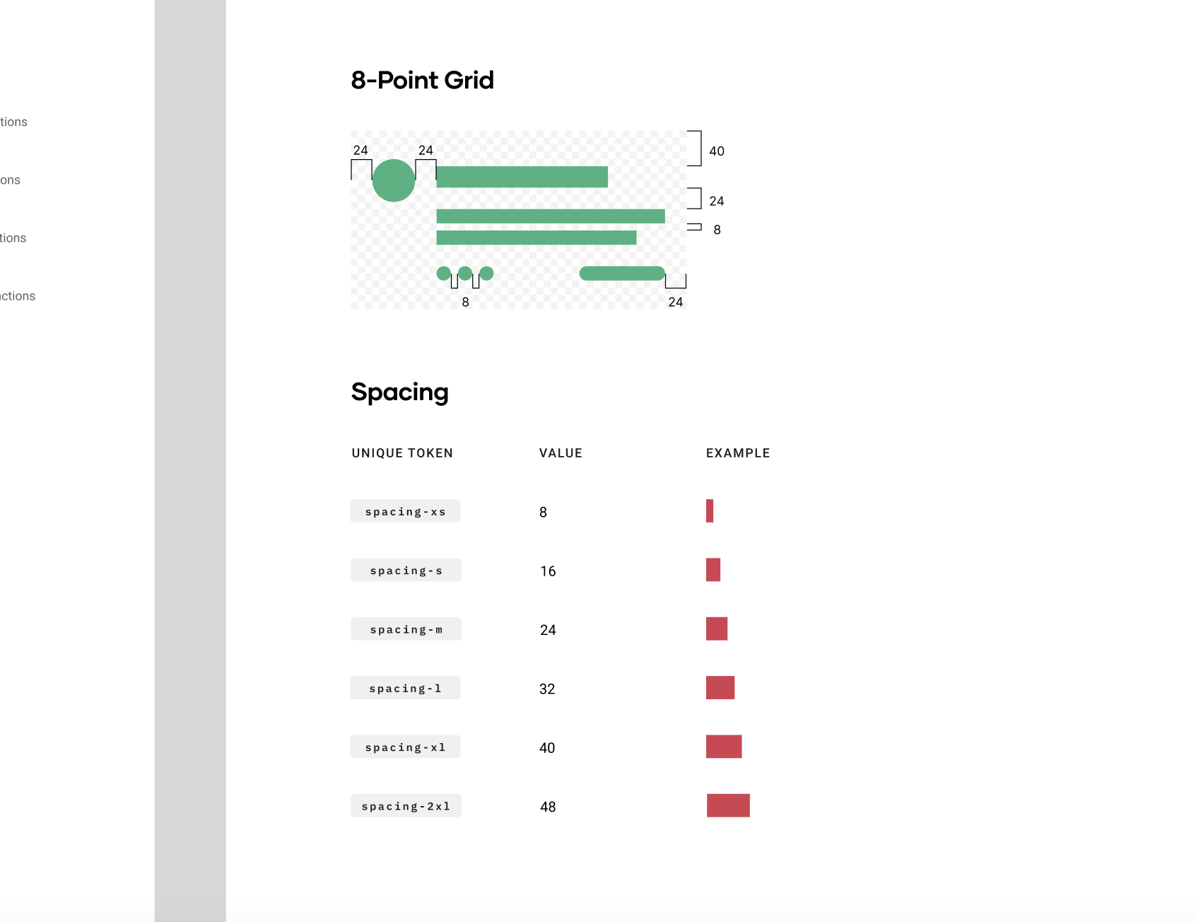
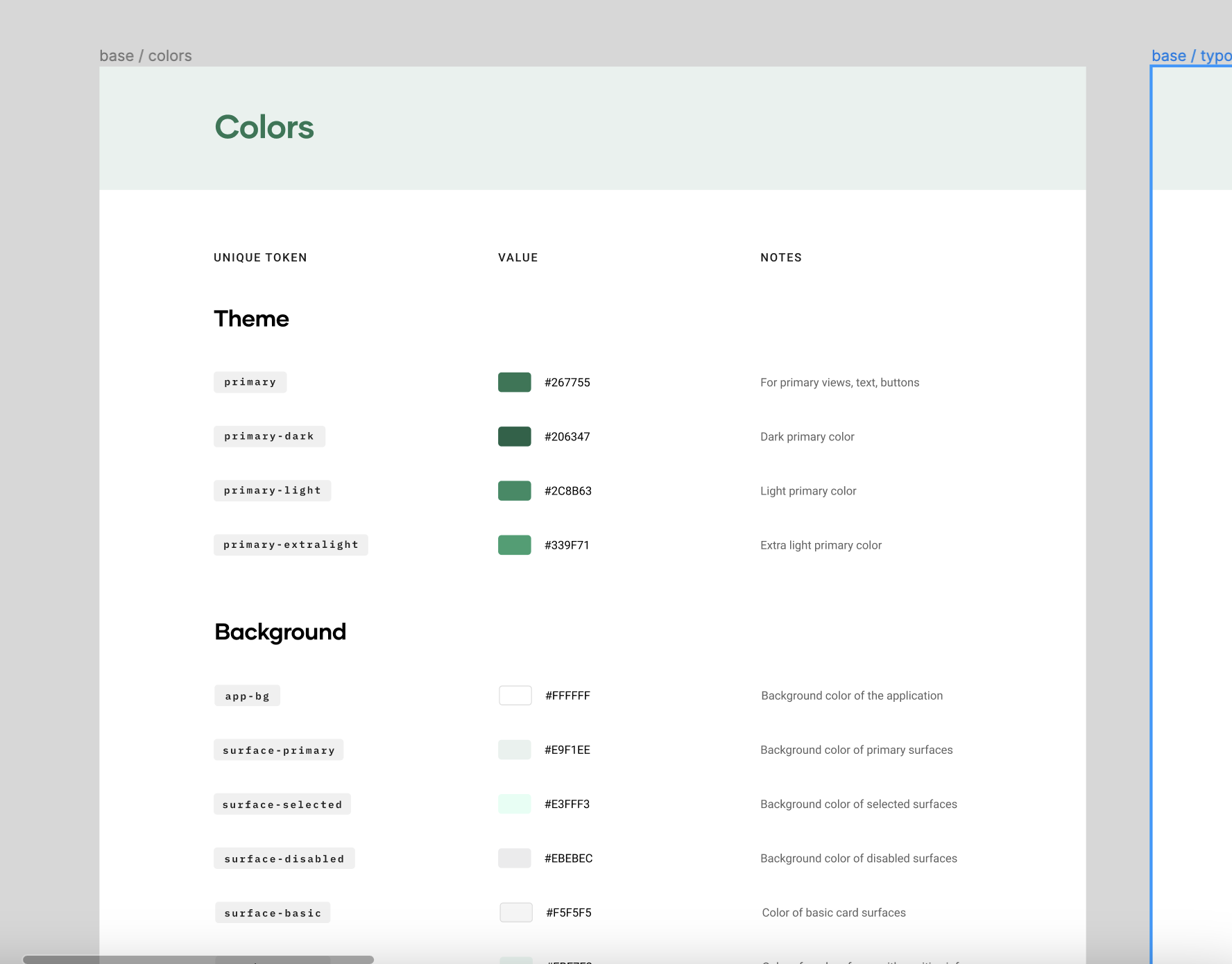
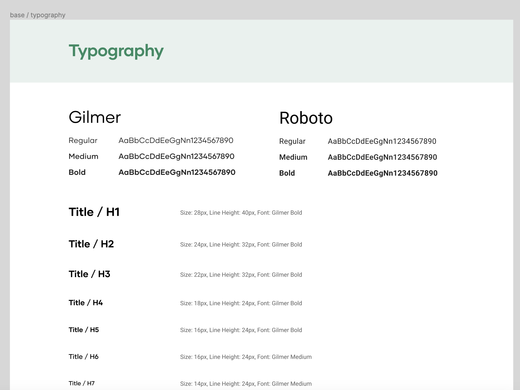
With a source of truth in place, core UI inconsistencies across spacing, typography, sizing, and color were resolved.
We rolled out a 3-month implementation plan to update designs, introduce UX improvements, and work closely with engineering to ensure design system adoption.
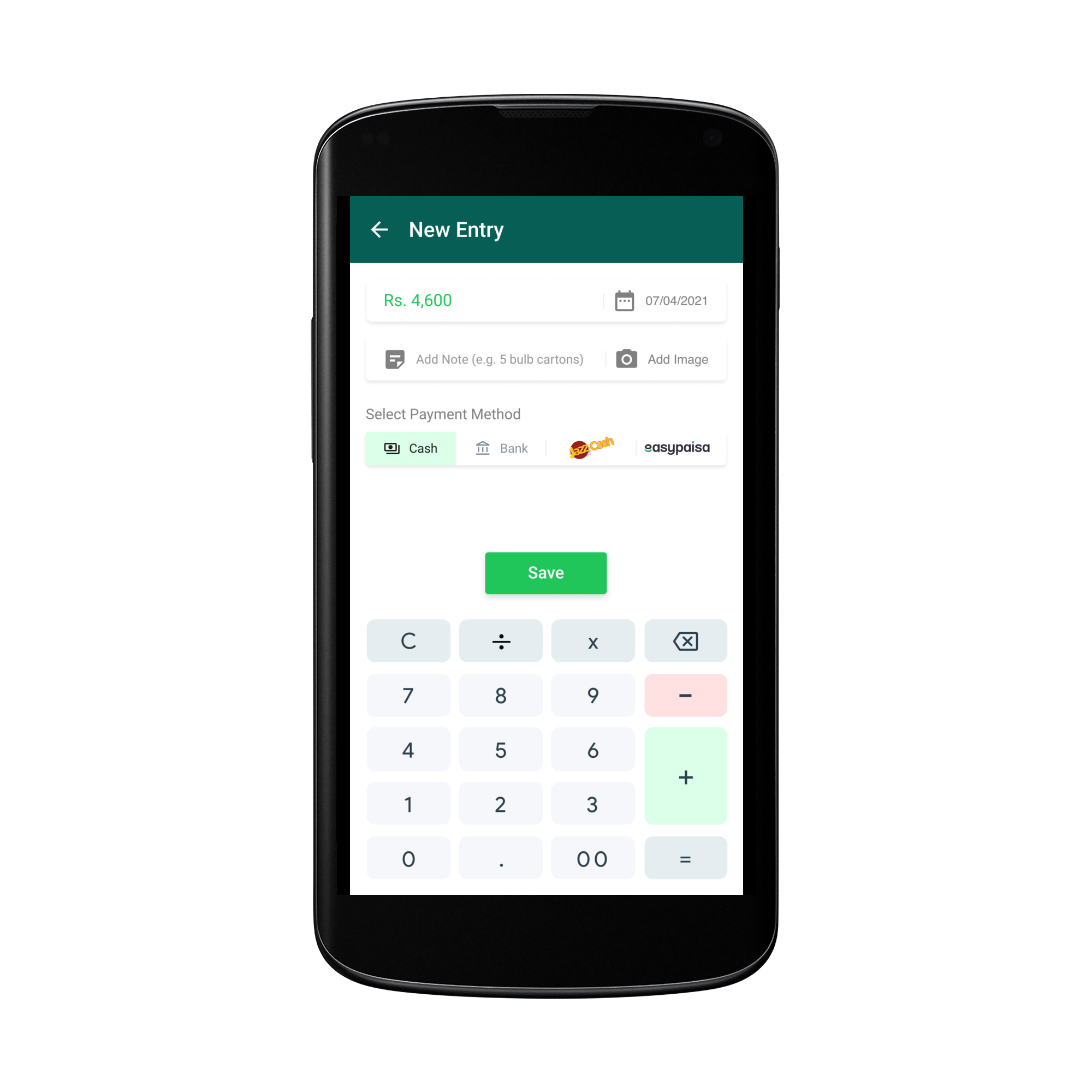
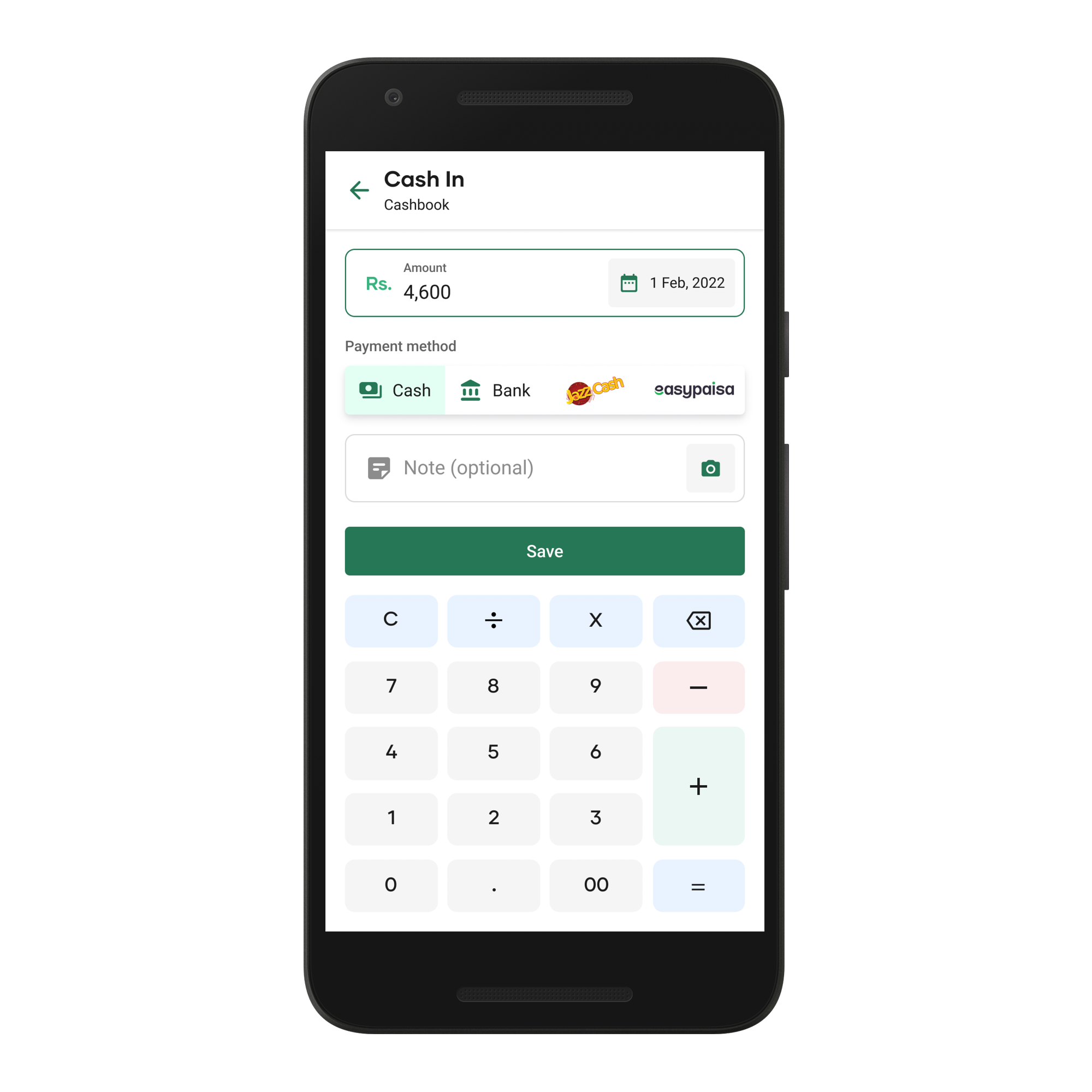
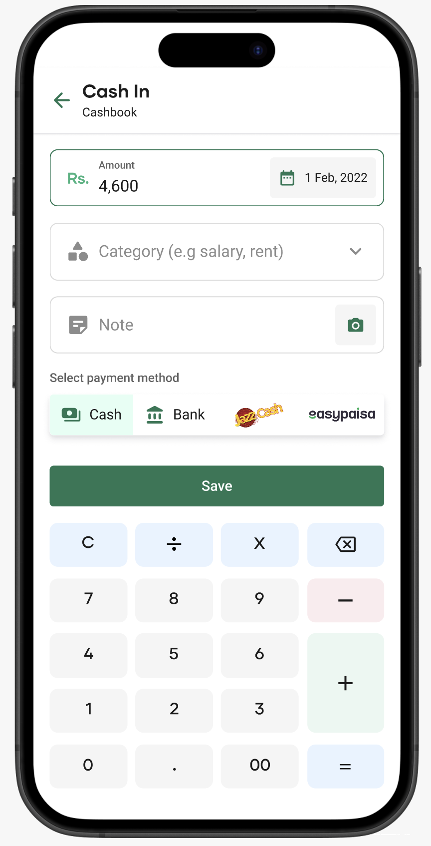
Cash In — before and after design system implementation
A key goal was to improve the Home screen. I led a brainstorming session to explore usability improvements.
We aligned on a direction to create a more intuitive experience and improve the visibility of tools that support users’ businesses.
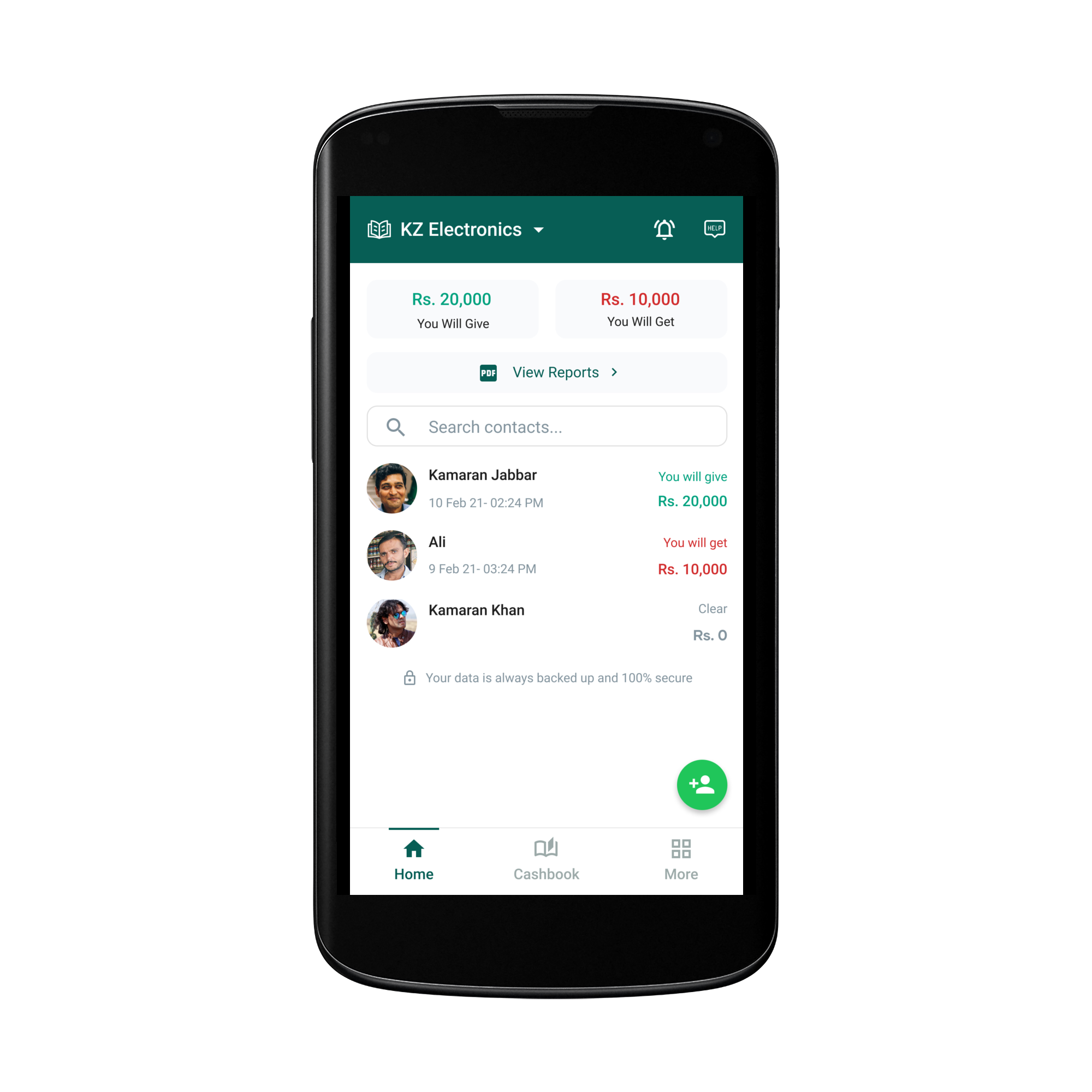
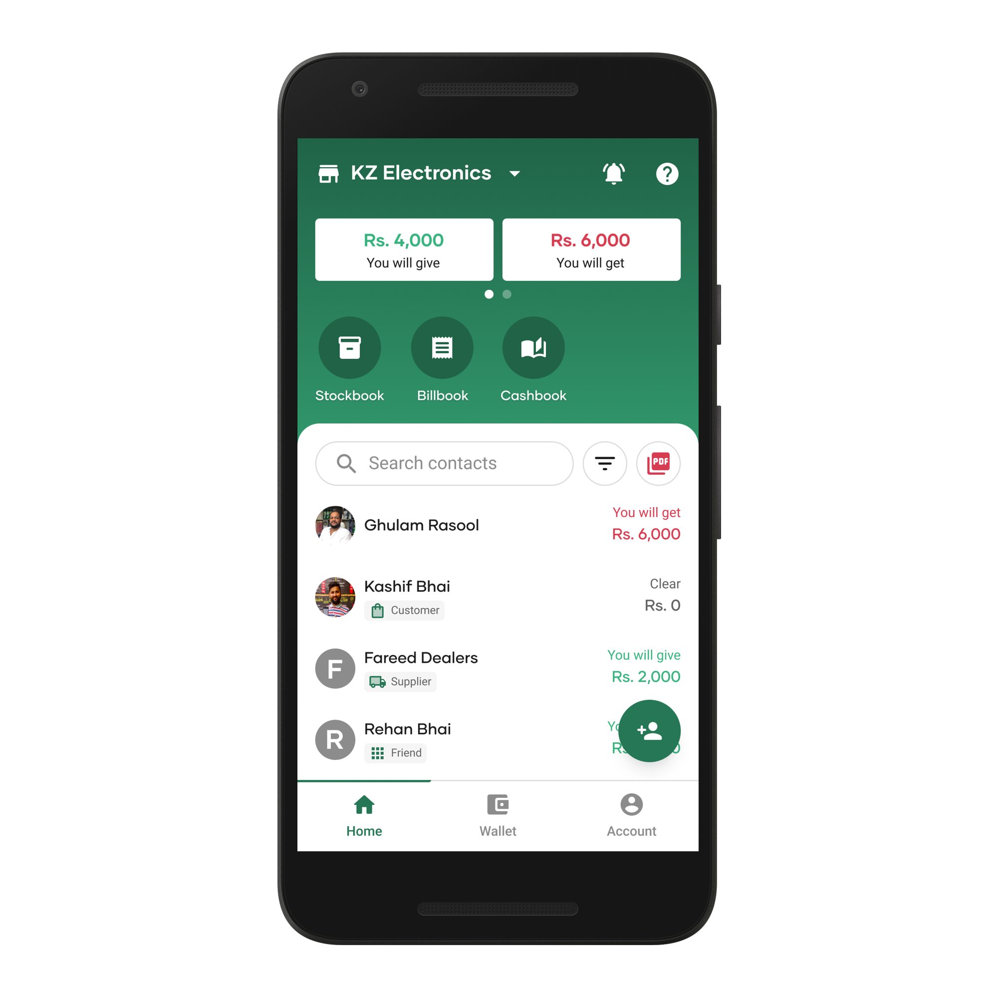
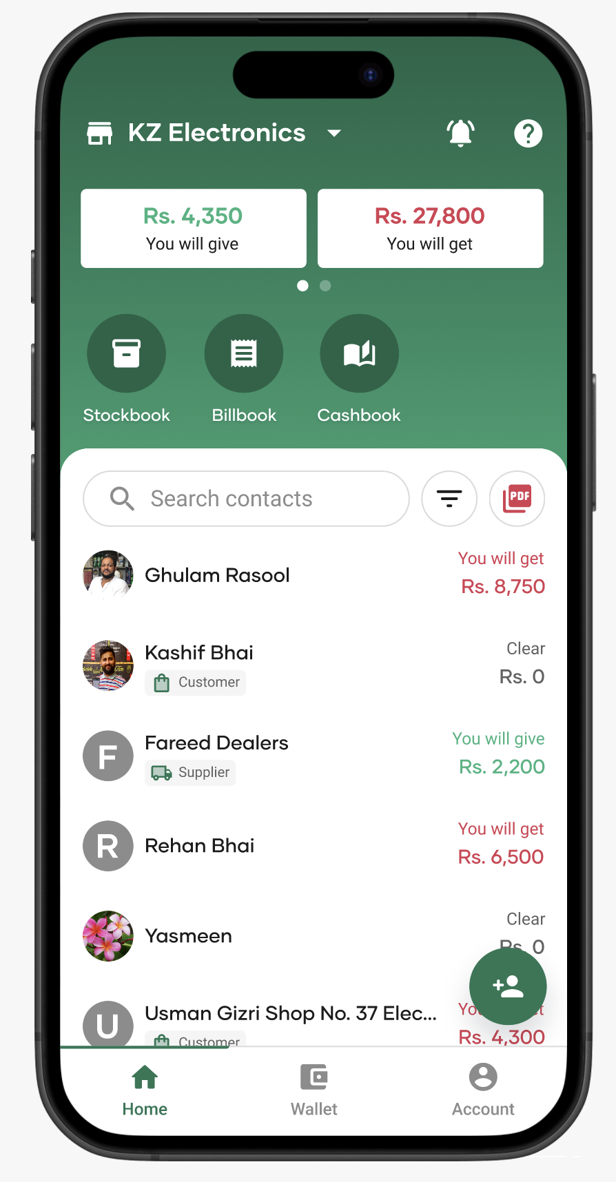
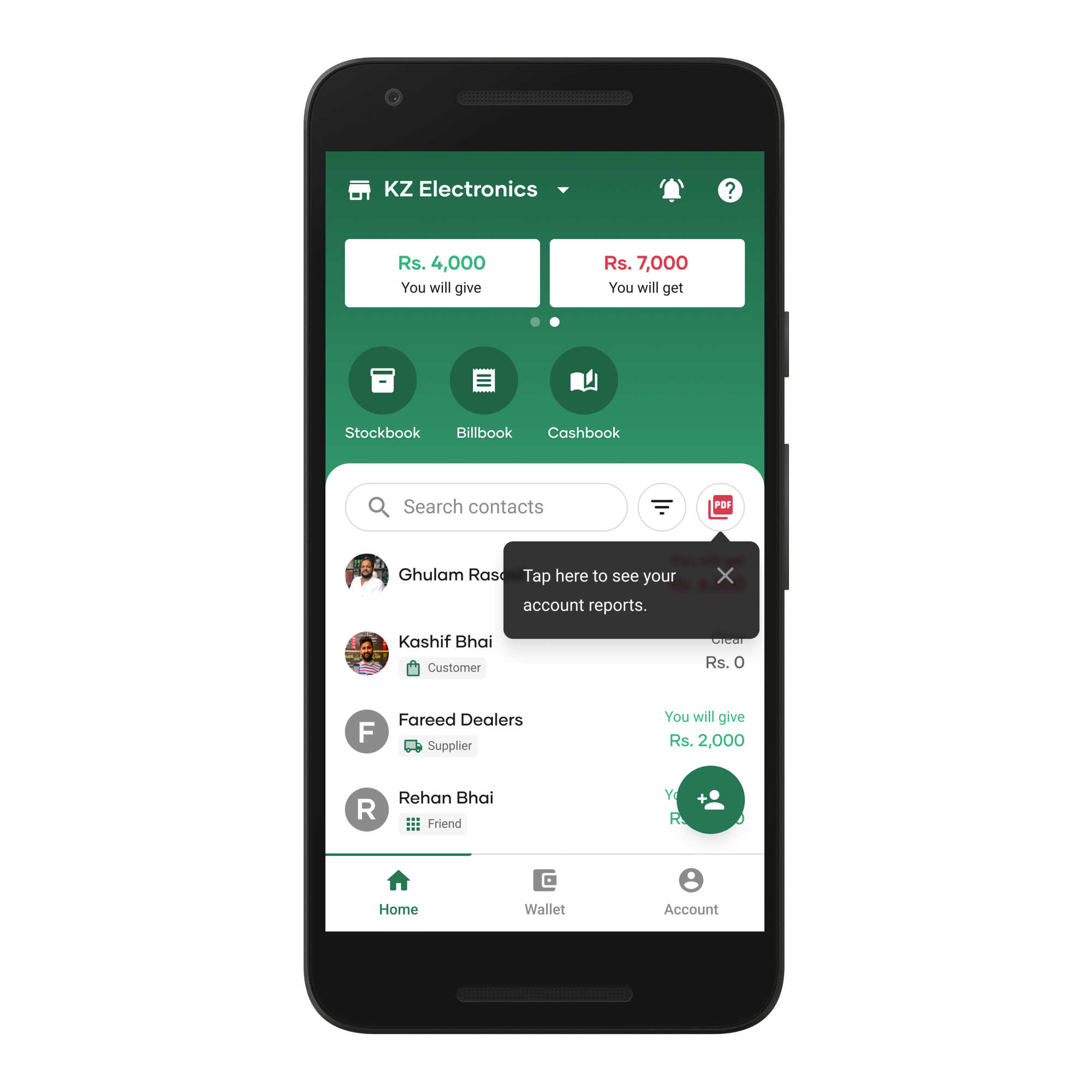
Home — before and after design system implementation
We introduced a section to display additional tools and run targeted experiments.
To improve contact navigation, we introduced an expandable contacts list with labels to distinguish contact types.
Based on user feedback, we moved Net Balance from Reports to the Home screen using a secondary card interaction for quicker access.
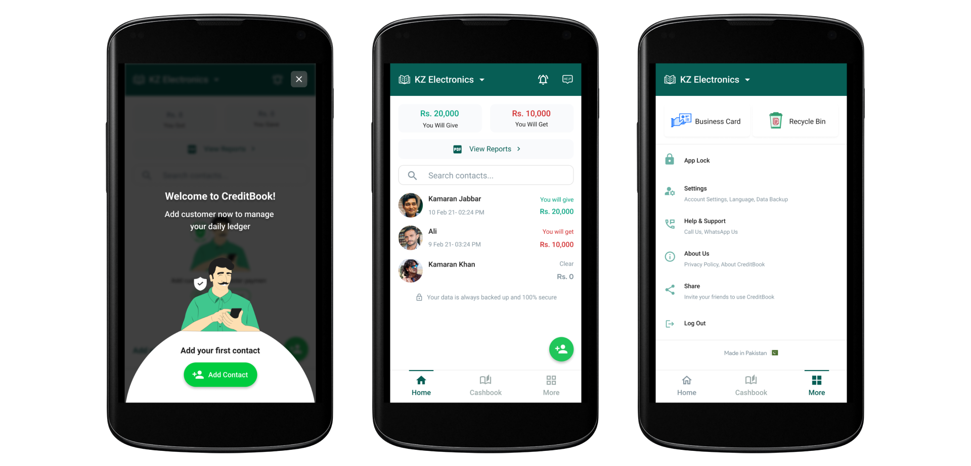
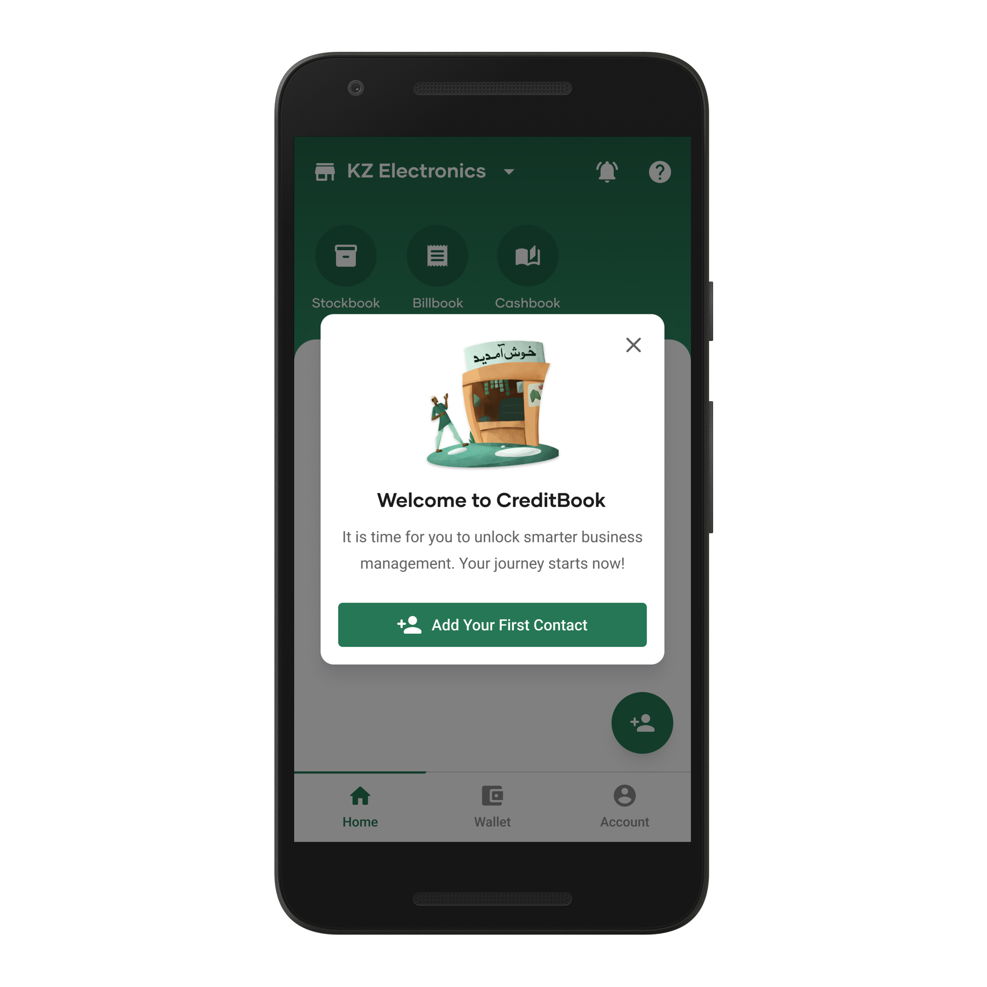
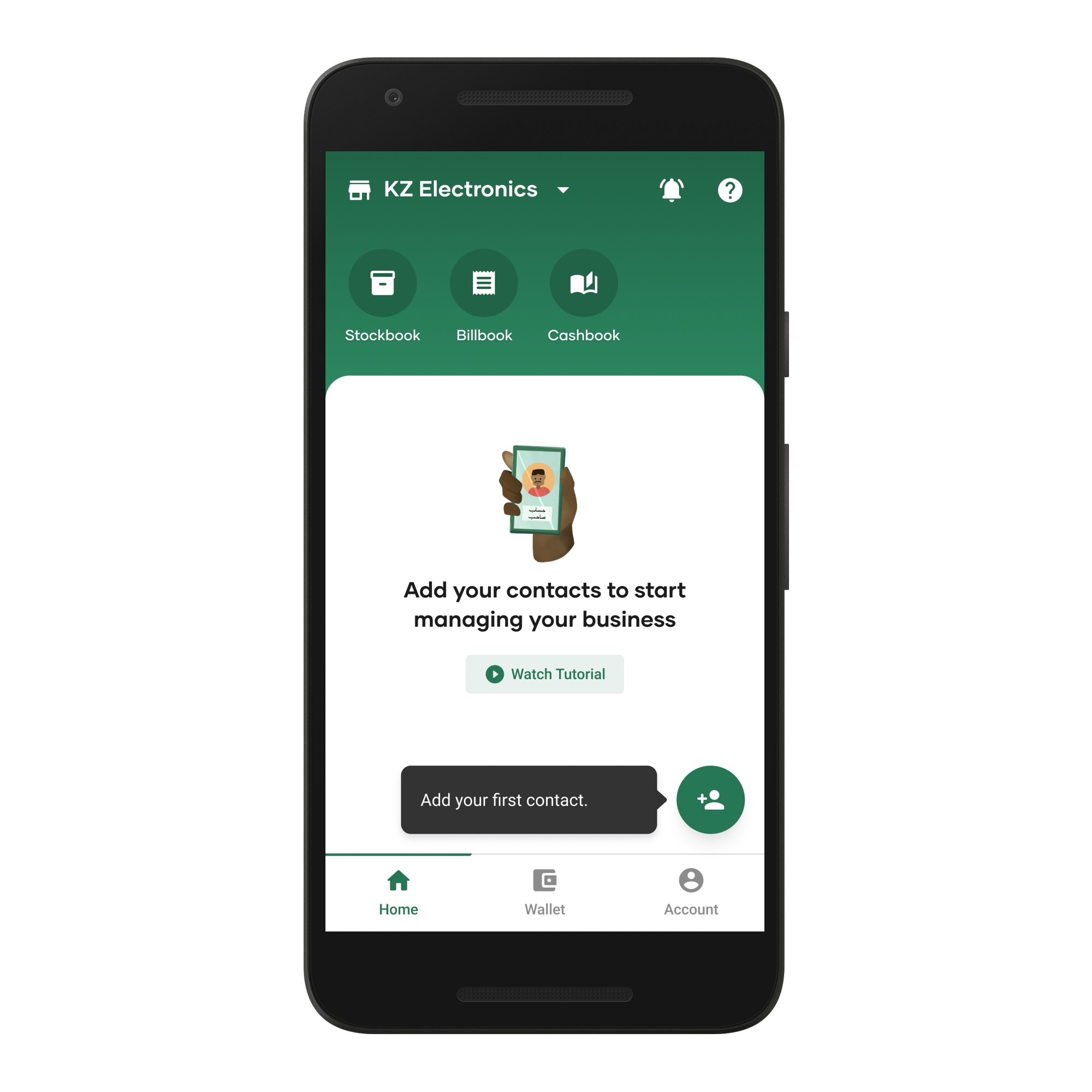
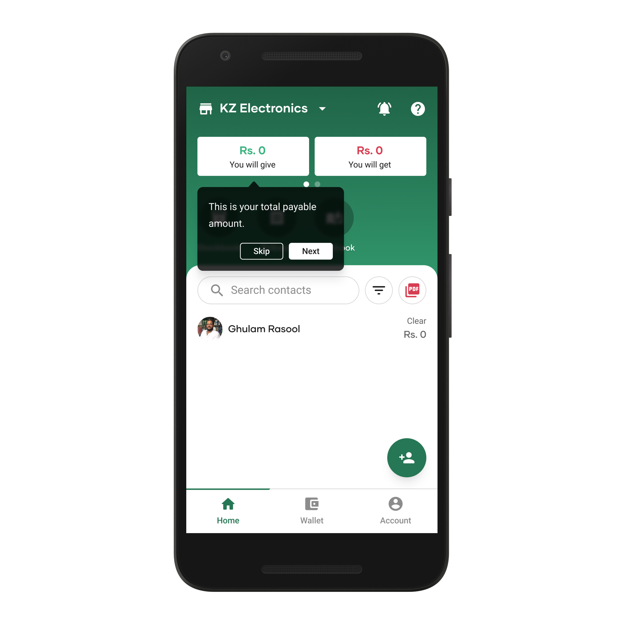
Product education was improved through contextual tooltips that appear when users need them, guiding the journey without overwhelming with excess information.
Outcomes
The redesign improved user satisfaction and created a scalable foundation.
Users preferred the cleaner interface and easier feature discovery, helping CreditBook stand apart from competitors.
Within three months, strong engagement with tools like StockBook and BillBook unlocked new growth opportunities.
Key takeaways
• Local context can matter more than global design norms
• Usability over decorative visuals leads to stronger experiences


© 2026 Osama Noor
Made in Karachi, by yours truly.
Last updated on Feb 28, 2026

Osama Noor
Home
Resume
Improving usability in a ledger app for small businesses
CreditBook · 2022 ·
Fintech
B2B
Redesign
Background
I joined CreditBook as a Senior Product Designer in late 2021 as part of a team of three designers and two user researchers.
At the time, CreditBook’s business management app was beginning to show friction as the company explored new growth areas.
This is how the app looked like when I joined CreditBook
Challenge
New users found the app difficult to use, long-time users began switching to competitors, and newly launched features struggled with adoption.
The visual identity resembled WhatsApp, leading to brand misalignment and an inconsistent user experience.
Research
We conducted user interviews and usability testing with active and recently churned users to understand pain points and behaviors.
Our core users were small-to-medium business owners, primarily aged 30–45, and late adopters of technology.
What we learned
We ran a collaborative synthesis session where designers and researchers shared their notes to uncover recurring themes and patterns.
After a round of prioritization, we highlighted the following observations.
Design strategy
The findings made it clear that isolated fixes wouldn’t resolve the systemic issues across the product.
I proposed creating a design system to address core UI inconsistencies while redesigning key modules to improve the experience.
With approval from the Head of Design, I built the company’s first design system from the ground up.
Implementation
With a source of truth in place, core UI inconsistencies across spacing, typography, sizing, and color were resolved.
We rolled out a 3-month implementation plan to update designs, introduce UX improvements, and work closely with engineering to ensure design system adoption.
Cash In — before and after design system implementation
A key goal was to improve the Home screen. I led a brainstorming session to explore usability improvements.
We aligned on a direction to create a more intuitive experience and improve the visibility of tools that support users’ businesses.
Home — before and after design system implementation
We introduced a section to display additional tools and run targeted experiments.
To improve contact navigation, we introduced an expandable contacts list with labels to distinguish contact types.
Based on user feedback, we moved Net Balance from Reports to the Home screen using a secondary card interaction for quicker access.
Product education was improved through contextual tooltips that appear when users need them, guiding the journey without overwhelming with excess information.
Outcomes
The redesign improved user satisfaction and created a scalable foundation.
Users preferred the cleaner interface and easier feature discovery, helping CreditBook stand apart from competitors.
Within three months, strong engagement with tools like StockBook and BillBook unlocked new growth opportunities.
Key takeaways
• Local context can matter more than global design norms
• Usability over decorative visuals leads to stronger experiences

© 2026 Osama Noor
Made in Karachi, by yours truly.
Last updated on Feb 28, 2026
Osama Noor
Home
Resume
Improving usability in a ledger app for small businesses
CreditBook · 2022 ·
Fintech
B2B
Redesign
Background
I joined CreditBook as a Senior Product Designer in late 2021 as part of a team of three designers and two user researchers.
At the time, CreditBook’s business management app was beginning to show friction as the company explored new growth areas.
This is how the app looked like when I joined CreditBook
Challenge
New users found the app difficult to use, long-time users began switching to competitors, and newly launched features struggled with adoption.
The visual identity resembled WhatsApp, leading to brand misalignment and an inconsistent user experience.
Research
We conducted user interviews and usability testing with active and recently churned users to understand pain points and behaviors.
Our core users were small-to-medium business owners, primarily aged 30–45, and late adopters of technology.
What we learned
We ran a collaborative synthesis session where designers and researchers shared their notes to uncover recurring themes and patterns.
After a round of prioritization, we highlighted the following observations.
Design strategy
The findings made it clear that isolated fixes wouldn’t resolve the systemic issues across the product.
I proposed creating a design system to address core UI inconsistencies while redesigning key modules to improve the experience.
With approval from the Head of Design, I built the company’s first design system from the ground up.
Implementation
With a source of truth in place, core UI inconsistencies across spacing, typography, sizing, and color were resolved.
We rolled out a 3-month implementation plan to update designs, introduce UX improvements, and work closely with engineering to ensure design system adoption.
Cash In — before and after design system implementation
A key goal was to improve the Home screen. I led a brainstorming session to explore usability improvements.
We aligned on a direction to create a more intuitive experience and improve the visibility of tools that support users’ businesses.
Home — before and after design system implementation
We introduced a section to display additional tools and run targeted experiments.
To improve contact navigation, we introduced an expandable contacts list with labels to distinguish contact types.
Based on user feedback, we moved Net Balance from Reports to the Home screen using a secondary card interaction for quicker access.
Product education was improved through contextual tooltips that appear when users need them, guiding the journey without overwhelming with excess information.
Outcomes
The redesign improved user satisfaction and created a scalable foundation.
Users preferred the cleaner interface and easier feature discovery, helping CreditBook stand apart from competitors.
Within three months, strong engagement with tools like StockBook and BillBook unlocked new growth opportunities.
Key takeaways
• Local context can matter more than global design norms
• Usability over decorative visuals leads to stronger experiences
Back to Home
Redesigning how HR teams run workforce operations at scale
Edge · 2025

© 2026 Osama Noor
Made in Karachi, by yours truly.
Last updated on Feb 28, 2026